#HauteChat: When Freedom Tree’s Owner Talks Décor, We Listen

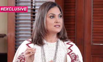
I am someone who could easily work as a part-time interior designer. Decorating and redecorating my room is basically my hobby, however annoying my mom thinks it is. So when I got the chance to interact with someone who eats, breathes, and lives in the world of décor, I was ecstatic. Latika Khosla is the founder of Freedom Tree Design, a décor brand that has slowly become one of the leaders in its industry. She is on the board of the Colour Marketing Group in USA and is a founder-organiser of Colours, India, a cross-industry open-sharing platform where designers meet and discuss colour and design trends for the Indian marketplace. She is also the India Director for the Pan Pacific Fashion Color Conference, a forecasting body for South East Asia. An alumni of the National Institute of Design, if there is someone who knows about colour and décor trends, it is definitely her.
A dynamic, soft spoken, and lovely woman, Latika met me at her Bandra store, which was bright and homely. She spoke about the trends that will be big in 2017, colour combinations that work best, essentials that you need to have, her favourite décor pieces, and anecdotes that will lighten your heart.
How did your journey in décor begin?
I was always passionate about drawing and painting, and wanted to do something that connects me with my passion. That’s how I enrolled in NID, some 35 years ago. I wanted to work on something that inspires people, and not just merely art.
How does Freedom Tree stand out from the crowd? What’s unique about it?
A gentleman once came to our Goa store and said that the store is a happy place, so I’m going to use his words and say that Freedom Tree is a happy place that is more about the customers than anything else.

What are your views about the Pantone colour of the year, Greenery? And how would you style it?
It is very ‘in’ and for years, we have been seeing a growing interest in everything tropical and natural. This year, we will style it with blues, greys, and maybe off-whites. Contrary to popular belief, it is actually an easy colour to use in homes — maybe as a vase or a bright cushion. Teaming it up with tropical hues is what we are looking at. Use it in accent pieces, in a base of a lampshade, or line your window sill with a neon green, and paint your ceiling in stripes of green and white — if you want to go all out that is!
What colour trends are going to be big in 2017?
It is all about nature this year and people are going to take inspiration from what they see around them. Colours that come from exotic birds, fish under the sea, the wings of a butterfly, and so on. But since nature can get boring, you need to strike a balance with hues like grey and nudes.


What is your home like?
My home is full of memories! I have a sofa that my in-laws gave me, one that they have had for almost 55 years now. We keep styling it as and when trends change, but it has been evergreen. I also have a carpet that has been woven in Afghan emitting a strong local vibe, thus telling us that furniture has stories to tell, if we are ready to listen. And paintings, lots of them!
How do we change our décor to make it more winter-friendly?
Lights always work. Coming home to warm fairy lights always feels good. Go for thicker curtains and put on some throws on your sofas. Opt for deeper, warmer colours like the mango yellow, amber, reds with a little teal thrown in — these minor changes can weave magic.
What are those happy colours that people should incorporate in their homes?
The shift from orange to amber which is like a gold touch should be used. Then peach with aqua green is another combination that is very happy. And just honest, rich, heart warming red.
What is the worst combination of colours?
Very interesting! There are no bad combinations. Colours are all pretty. The problem is when you use too much of one colour, which then hurts the eye. Make sure you have one colour as the hero and the others as extras to complement it. No movie is complete without the extras anyway! For instance, if you have red, use beige to tone it down.
What are the essentials for someone who is buying their first home?
- A dining table or a low coffee table is a must, because there is nothing more important than food.
- Two chairs or seatings, just to give your space that homely touch.
- And a bookshelf!
Everything else can come later.
Any parting décor tips?
Always have something living in your space, like plants or a bowl of oranges. Breathe some life into your space with paints — there’s nothing that paint can’t solve. Add colour to that boring old chair or keep colourful utensils in your kitchen.


